Client: Les Mills International
Les Mills+ Coach Landing page
Role
Lead Product Designer
TEAM
Design, Engineering, Product, Marketing, Growth, QA
Platform
iOS, Android

01 — Overview
Overview
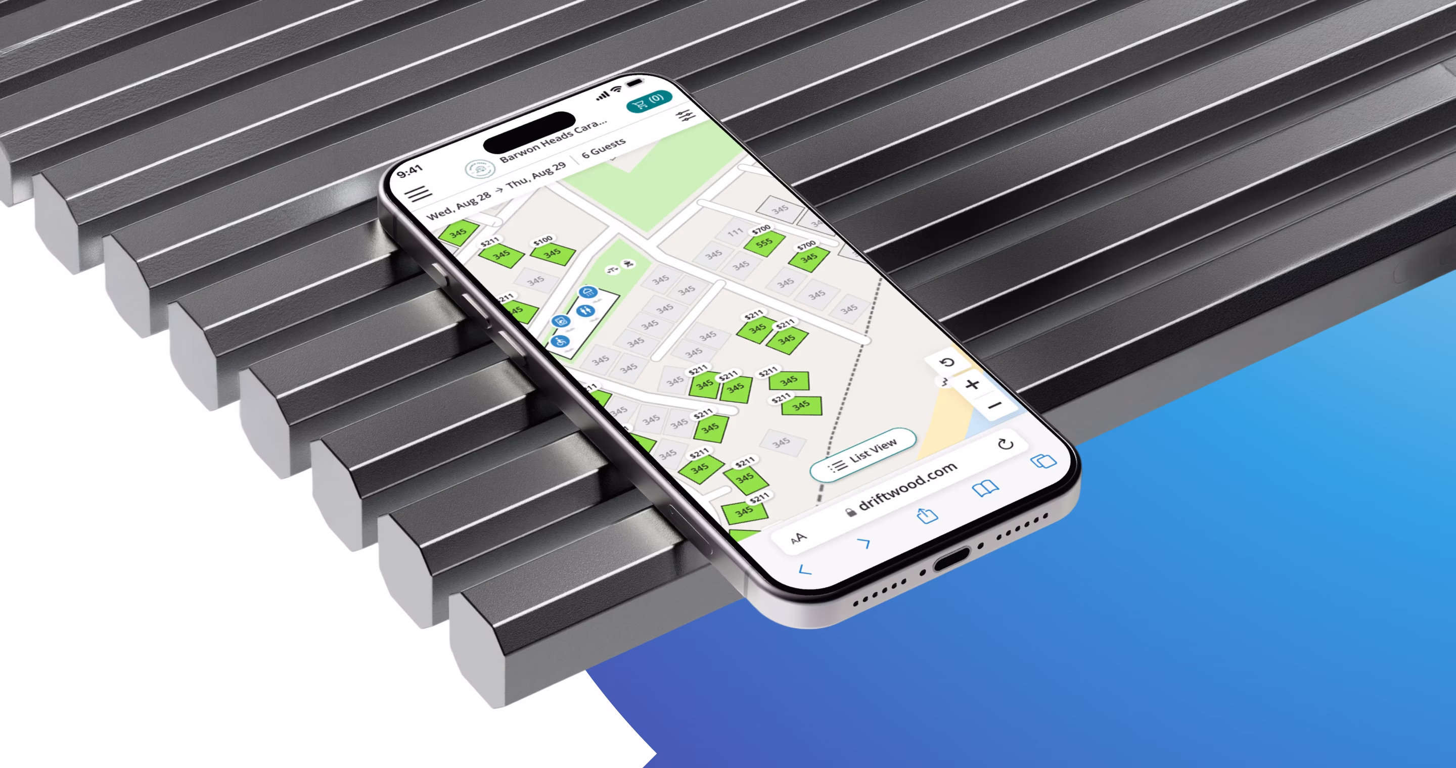
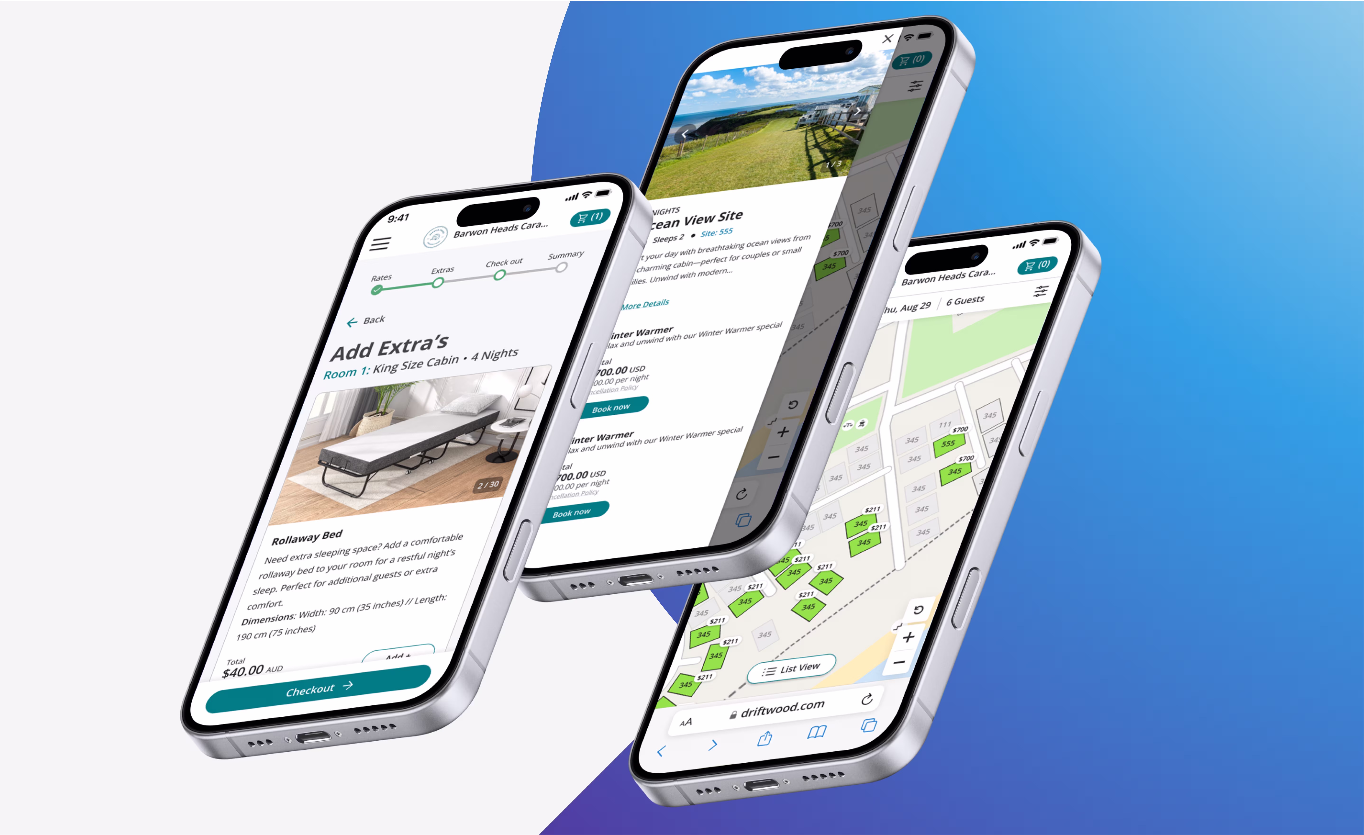
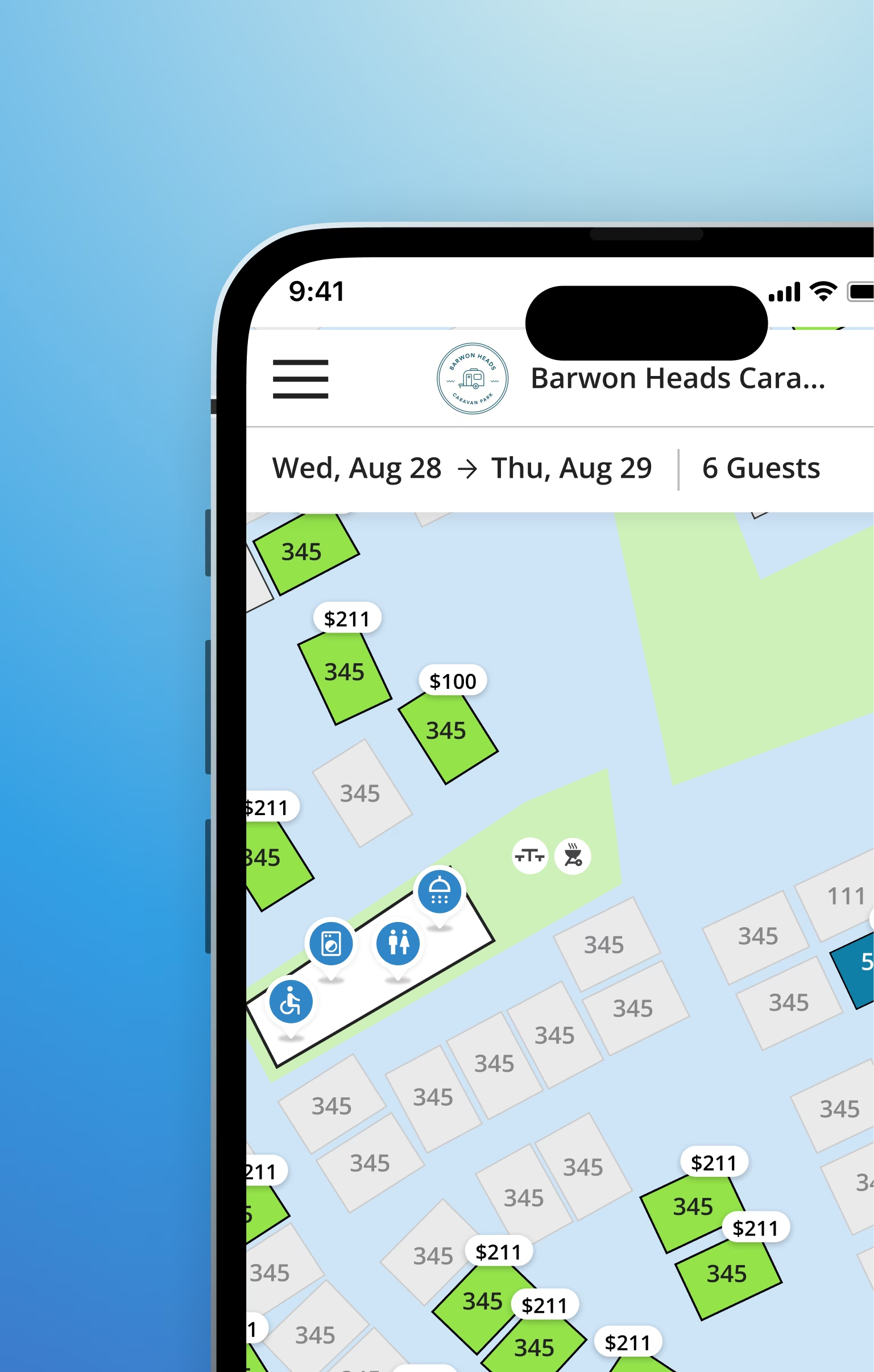
RMS is one of the world's fastest-growing property management platforms, used by holiday parks, caravan resorts, hotels, and specialist facilities across 70 countries.
For physical sites — campgrounds, caravan parks, glamping resorts — letting guests choose their exact spot is core to the booking experience. The old map system was broken. I was brought in to replace it entirely.
The solution shipped globally. Retention improved for properties using the maps feature. The prototype became an active sales tool to win new customers.
01 — Overview
The Problem
RMS is one of the world's fastest-growing property management platforms, used by holiday parks, caravan resorts, hotels, and specialist facilities across 70 countries.
For physical sites — campgrounds, caravan parks, glamping resorts — letting guests choose their exact spot is core to the booking experience. The old map system was broken. I was brought in to replace it entirely.
The solution shipped globally. Retention improved for properties using the maps feature. The prototype became an active sales tool to win new customers.
01 — Overview
My Role
RMS is one of the world's fastest-growing property management platforms, used by holiday parks, caravan resorts, hotels, and specialist facilities across 70 countries.
For physical sites — campgrounds, caravan parks, glamping resorts — letting guests choose their exact spot is core to the booking experience. The old map system was broken. I was brought in to replace it entirely.
The solution shipped globally. Retention improved for properties using the maps feature. The prototype became an active sales tool to win new customers.
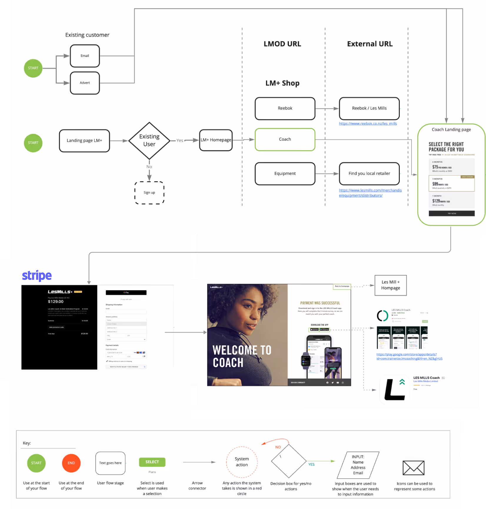
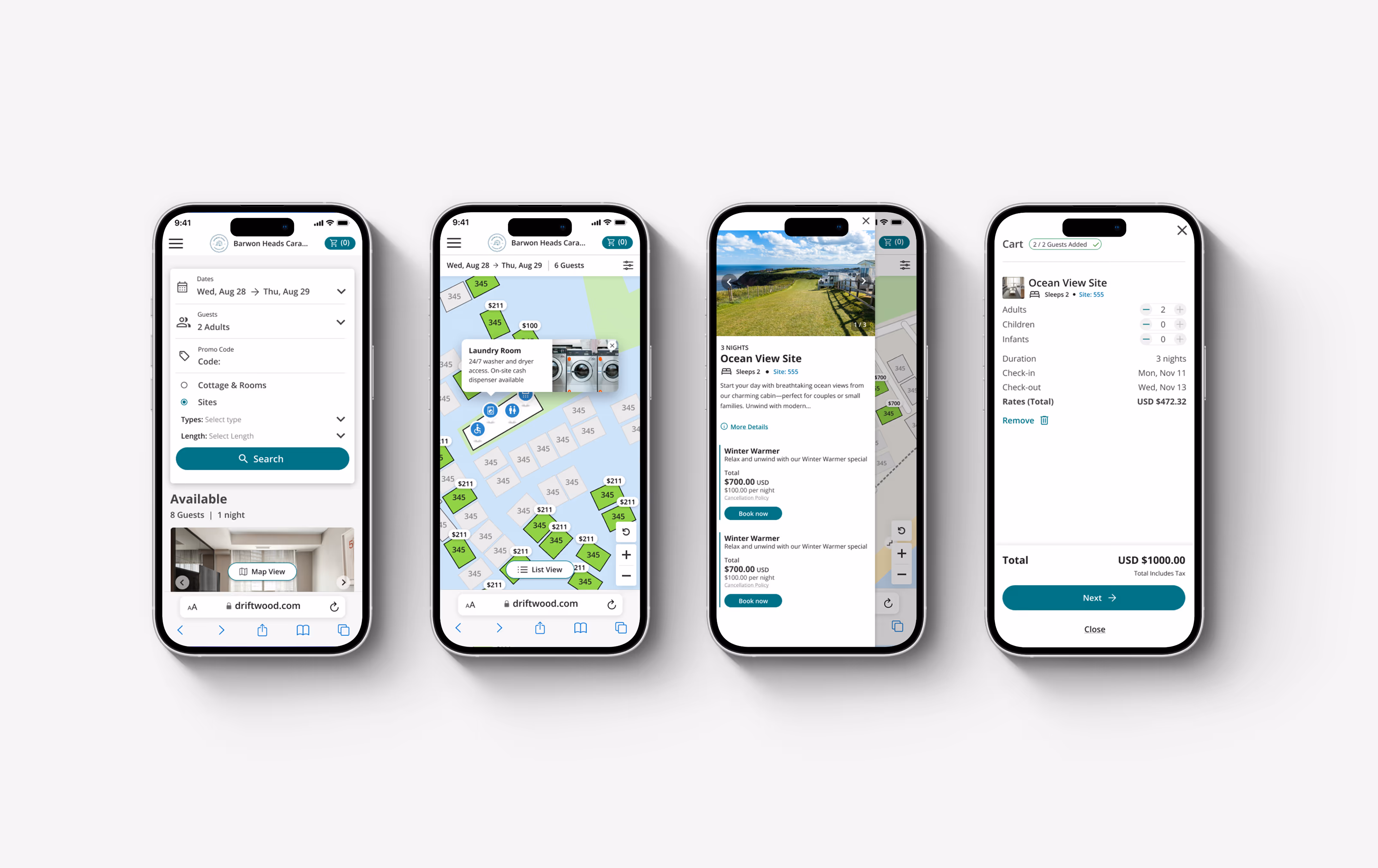
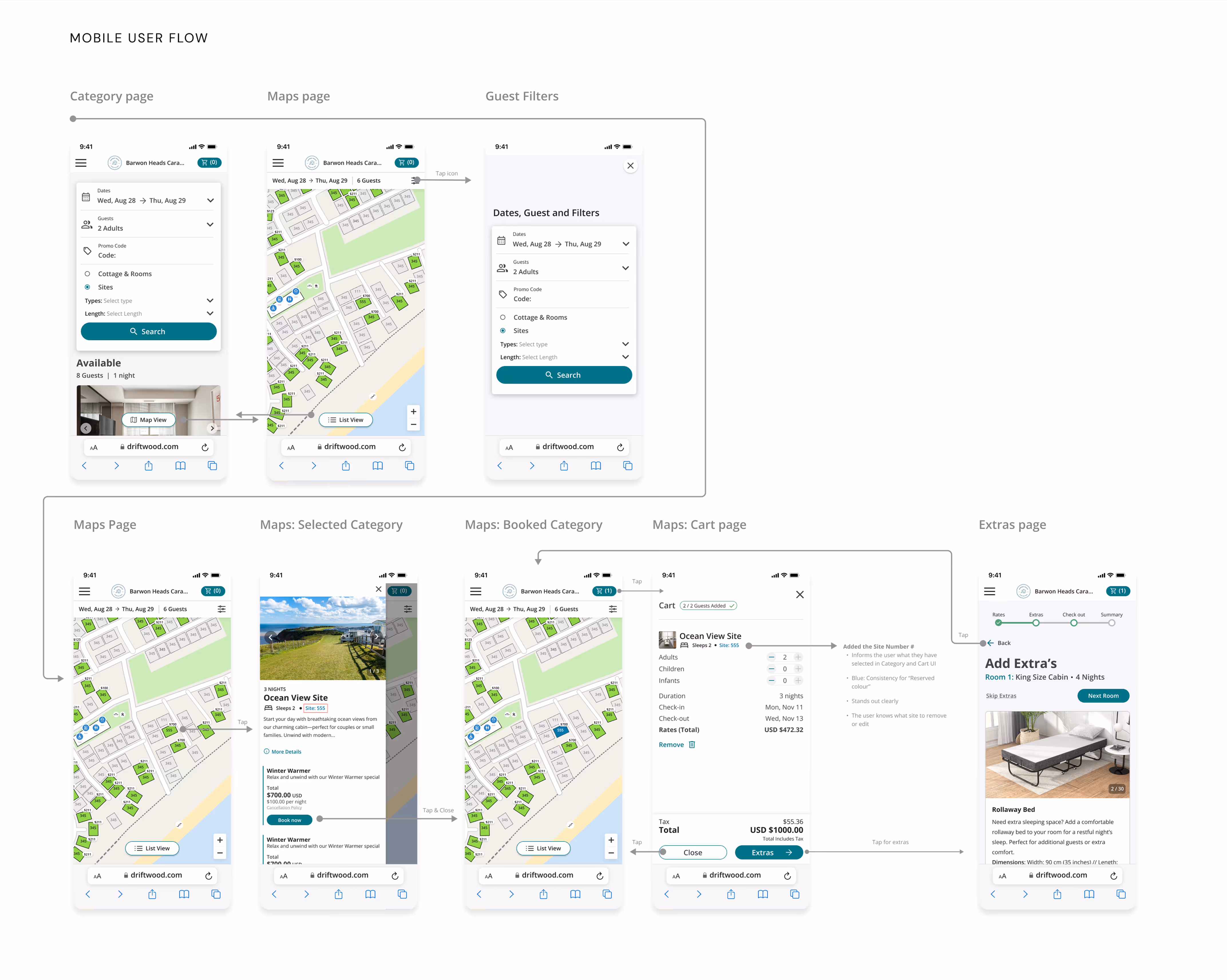
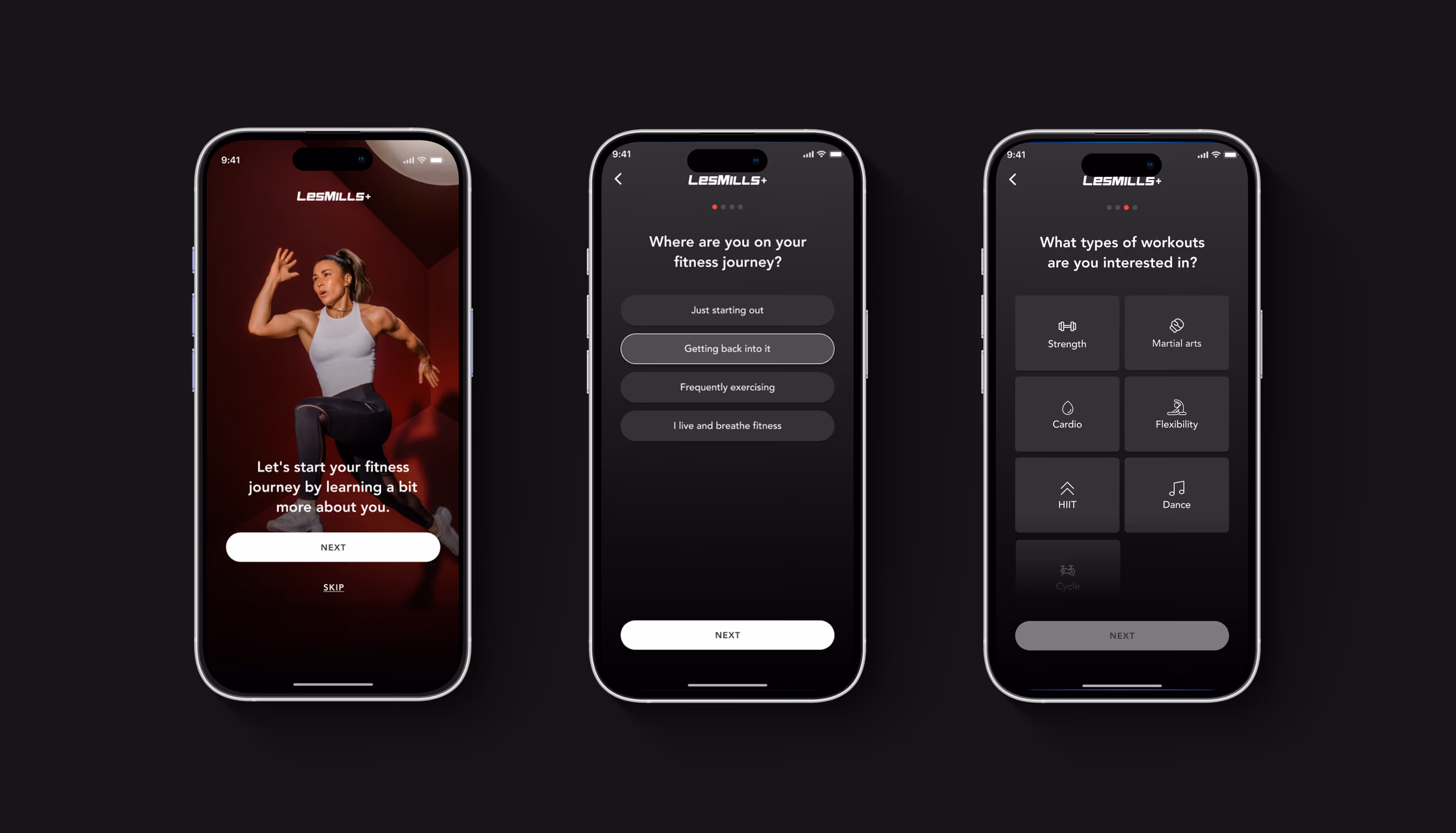
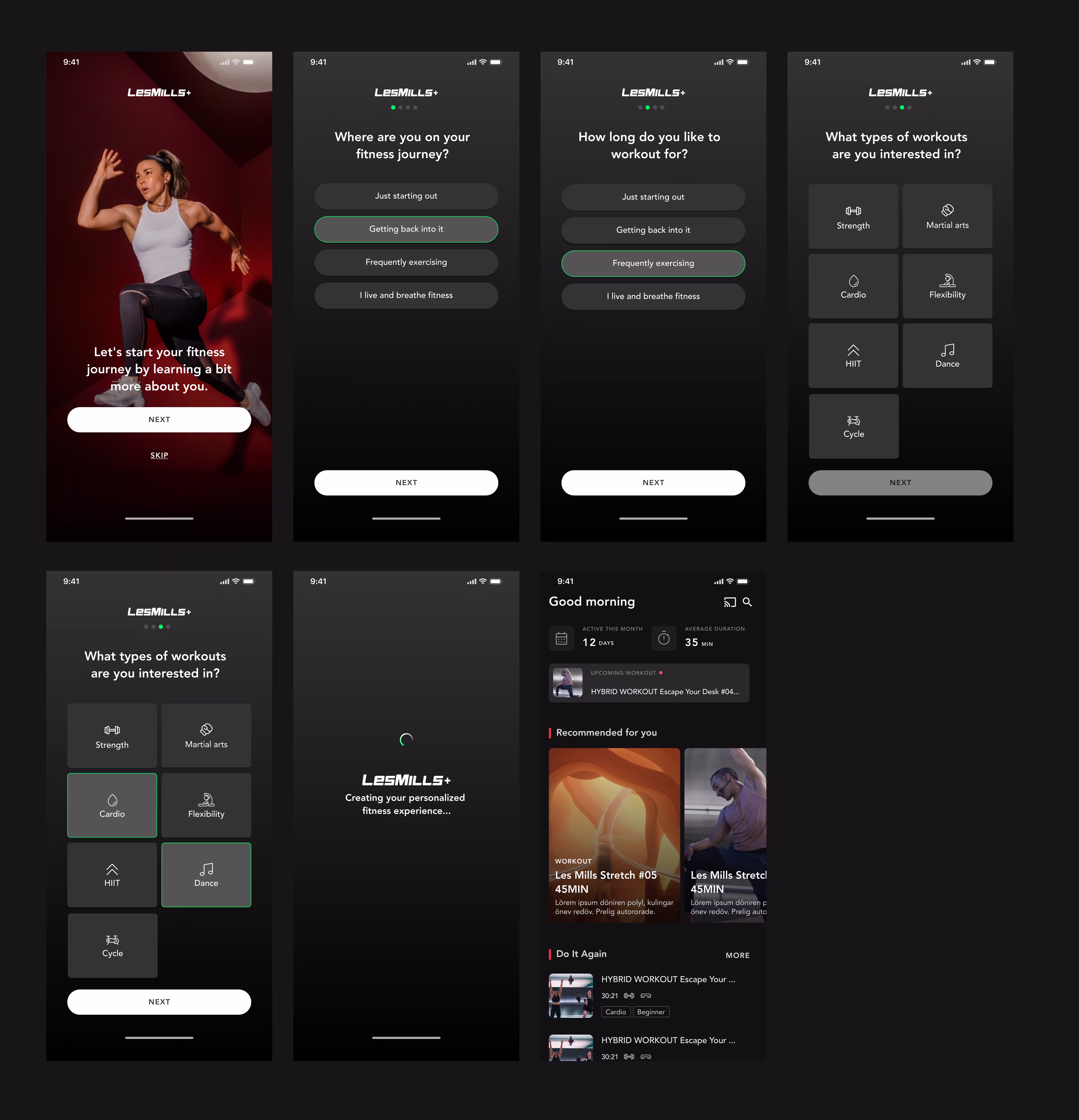
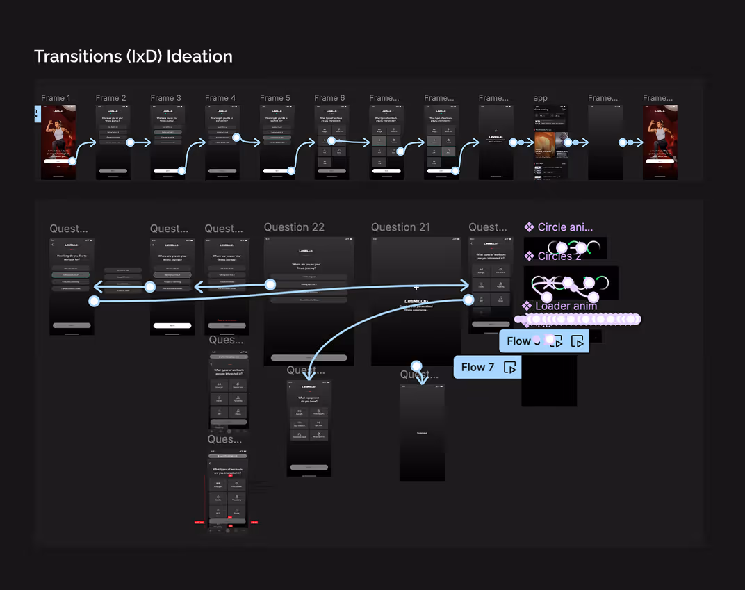
Userflow
01 — Overview
Key Insight
RMS is one of the world's fastest-growing property management platforms, used by holiday parks, caravan resorts, hotels, and specialist facilities across 70 countries.
For physical sites — campgrounds, caravan parks, glamping resorts — letting guests choose their exact spot is core to the booking experience. The old map system was broken. I was brought in to replace it entirely.
The solution shipped globally. Retention improved for properties using the maps feature. The prototype became an active sales tool to win new customers.
01 — Overview
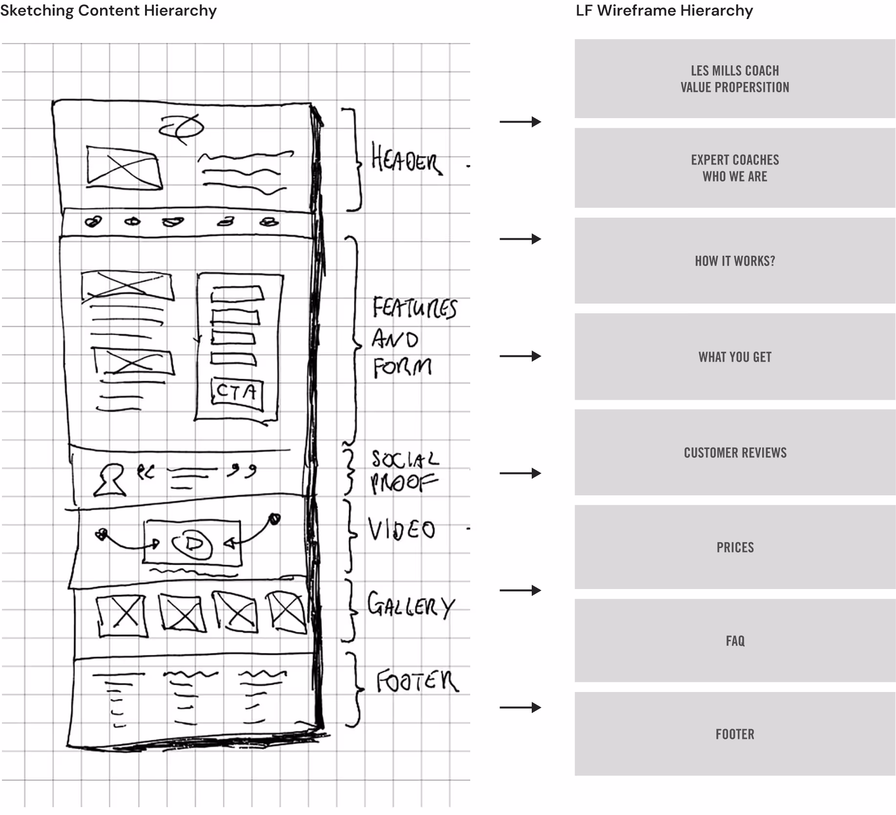
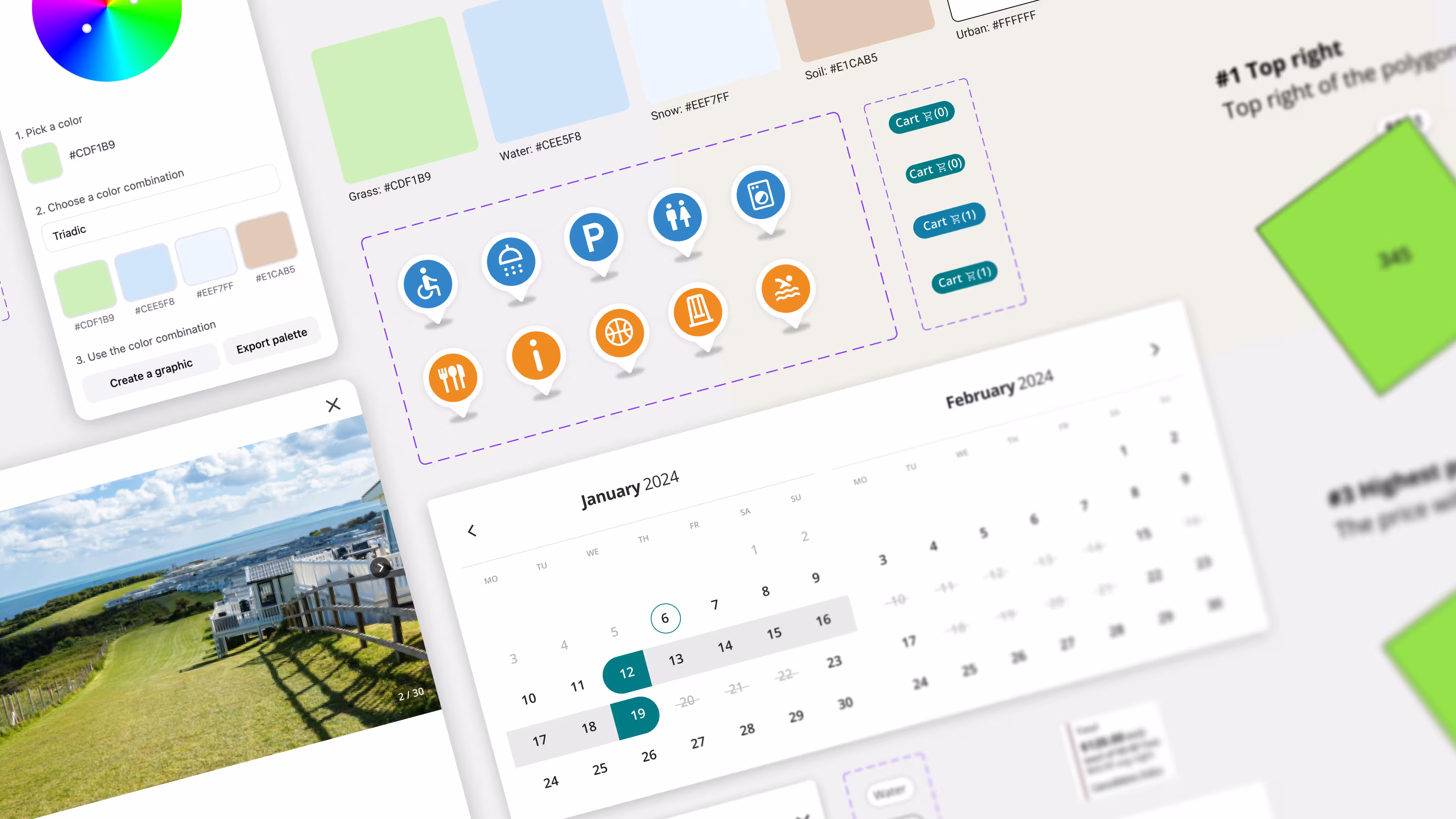
Hierarchy and information architecture
RMS is one of the world's fastest-growing property management platforms, used by holiday parks, caravan resorts, hotels, and specialist facilities across 70 countries.
For physical sites — campgrounds, caravan parks, glamping resorts — letting guests choose their exact spot is core to the booking experience. The old map system was broken. I was brought in to replace it entirely.
The solution shipped globally. Retention improved for properties using the maps feature. The prototype became an active sales tool to win new customers.
01 — Overview
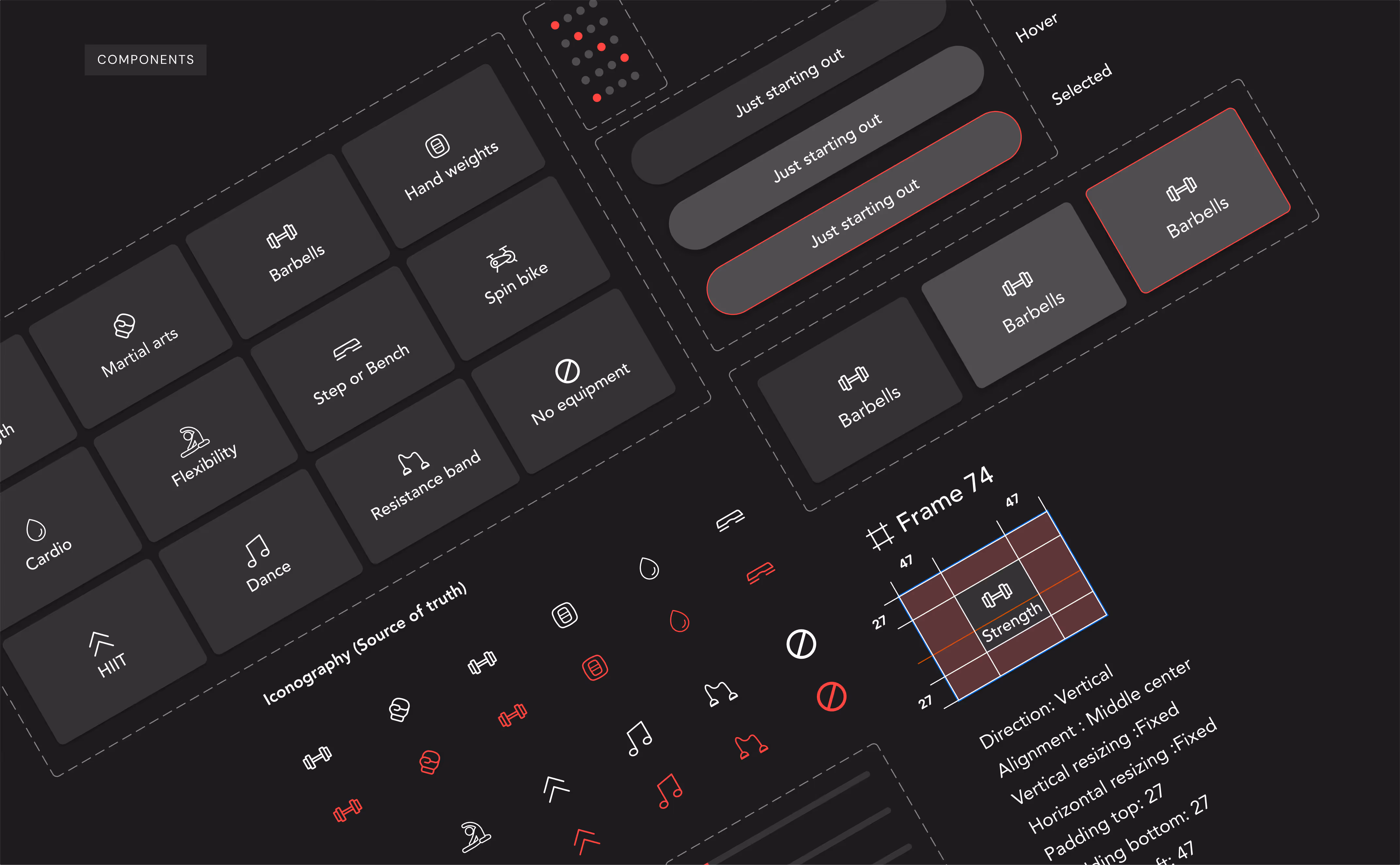
Pattern library & Dev Handover
RMS is one of the world's fastest-growing property management platforms, used by holiday parks, caravan resorts, hotels, and specialist facilities across 70 countries.
For physical sites — campgrounds, caravan parks, glamping resorts — letting guests choose their exact spot is core to the booking experience. The old map system was broken. I was brought in to replace it entirely.
The solution shipped globally. Retention improved for properties using the maps feature. The prototype became an active sales tool to win new customers.
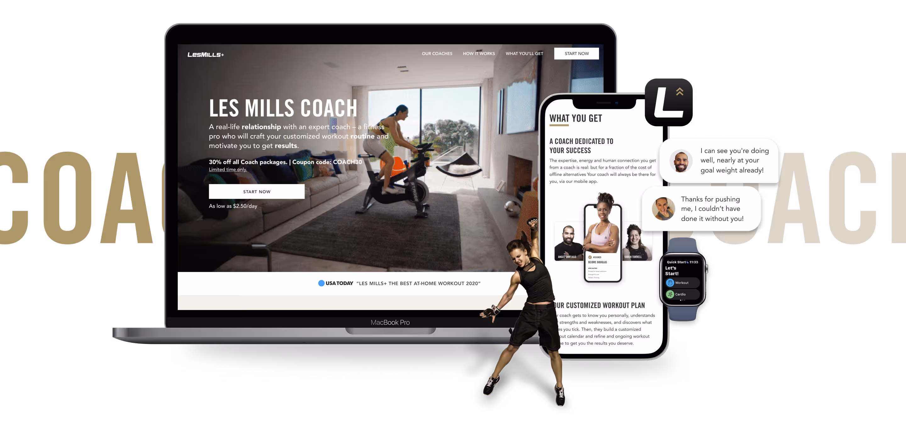
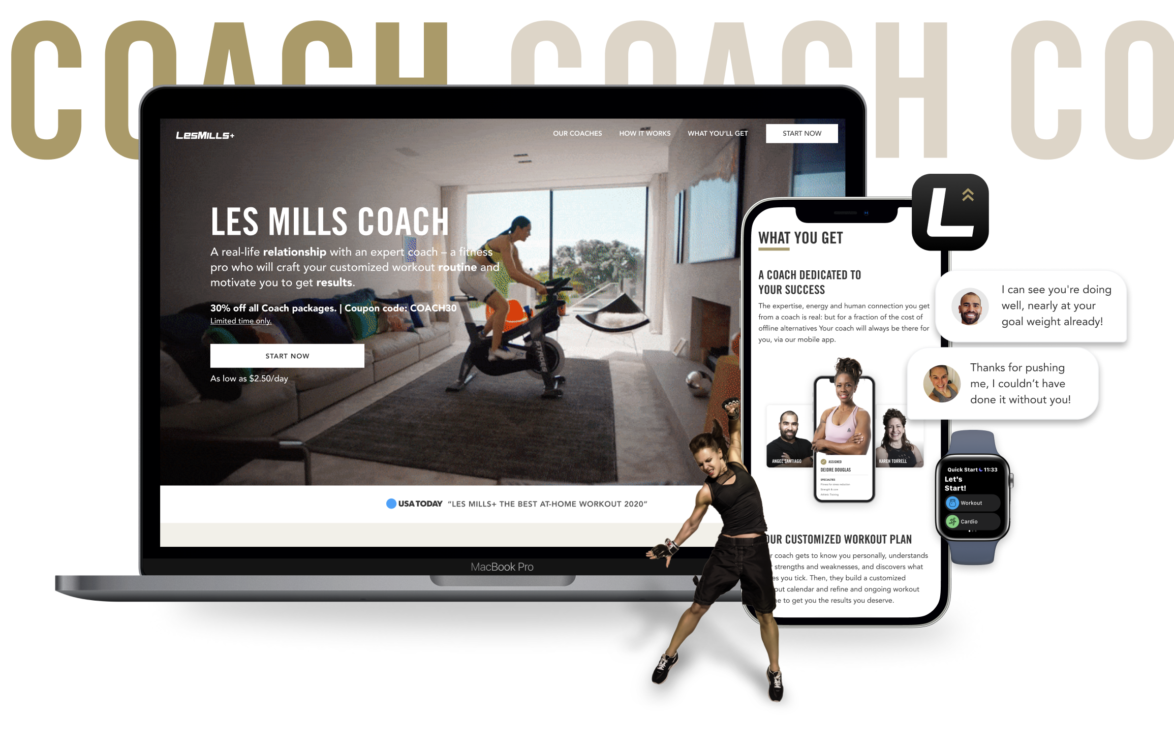
01 — Overview
The Solution
RMS is one of the world's fastest-growing property management platforms, used by holiday parks, caravan resorts, hotels, and specialist facilities across 70 countries.
For physical sites — campgrounds, caravan parks, glamping resorts — letting guests choose their exact spot is core to the booking experience. The old map system was broken. I was brought in to replace it entirely.
The solution shipped globally. Retention improved for properties using the maps feature. The prototype became an active sales tool to win new customers.
01 — Overview
Impact
RMS is one of the world's fastest-growing property management platforms, used by holiday parks, caravan resorts, hotels, and specialist facilities across 70 countries.
For physical sites — campgrounds, caravan parks, glamping resorts — letting guests choose their exact spot is core to the booking experience. The old map system was broken. I was brought in to replace it entirely.
The solution shipped globally. Retention improved for properties using the maps feature. The prototype became an active sales tool to win new customers.
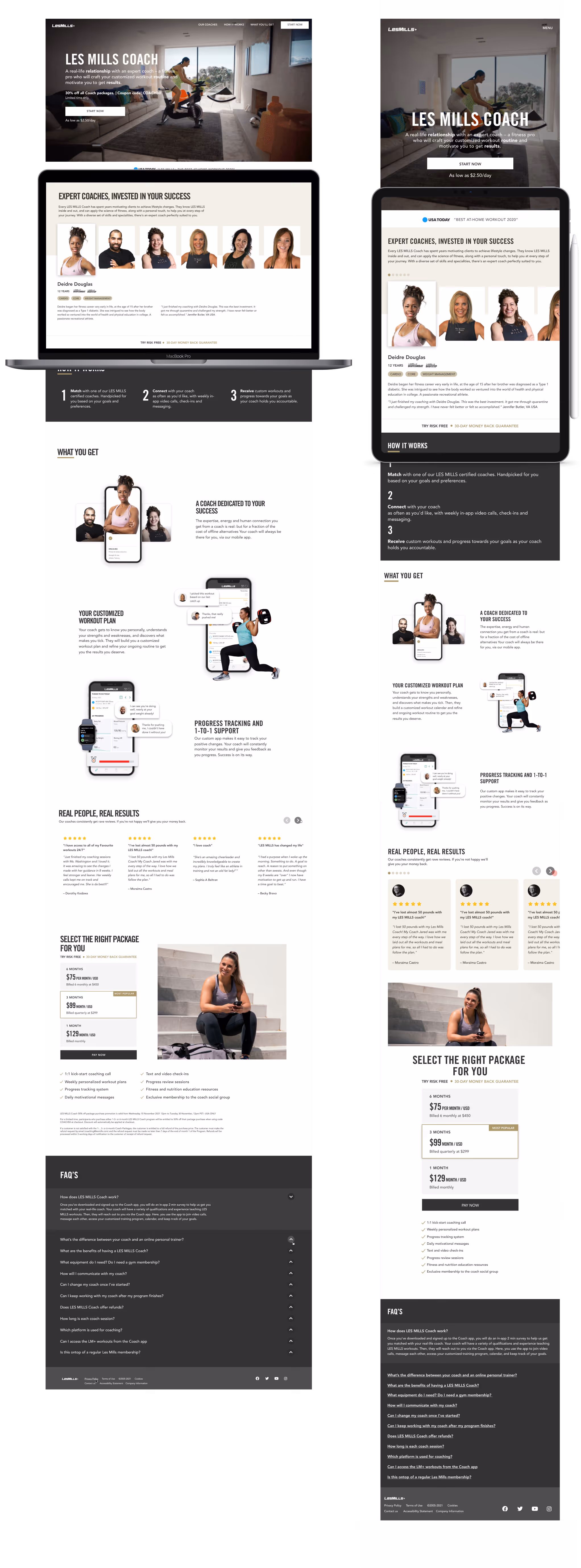
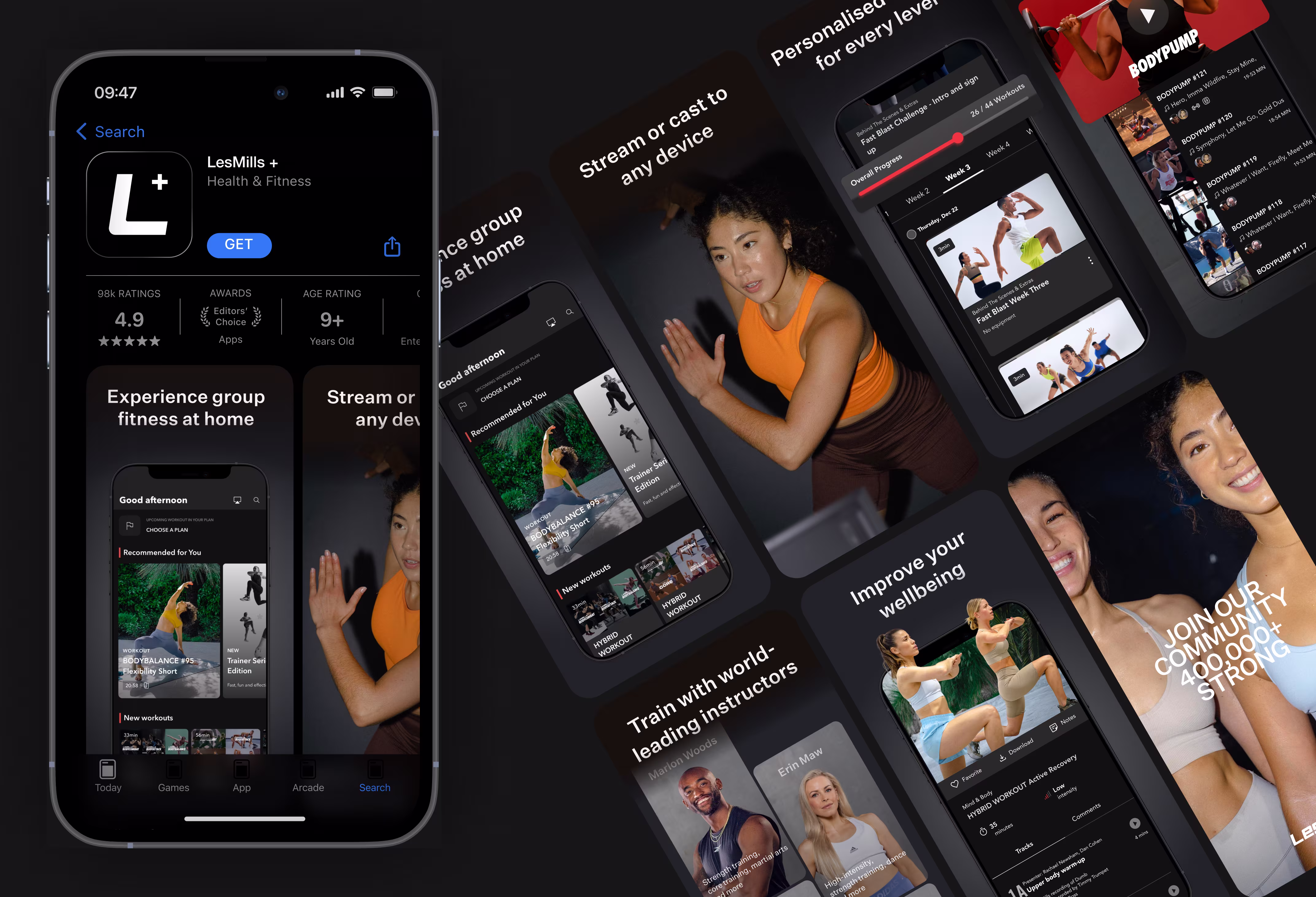
Designs


.avif)